#MonthlyRoundup: User-led feed building
TIMELINE
JAN-MAR 2023
ROLE
LEAD DESIGNER
THE CHALLENGE
As short-form content becomes increasingly popular, more companies seeing TikTok as a channel for interactive, bite-sized ways to promote their brand.
As part of Northwestern’s Bay Area Immersion Program, I worked with TikTok’s brand ads team to reimagine user-centered advertising on TikTok and provide both TikTok viewers and creators with heightened personalization and autonomy in the feed-building experience. We set off to explore:
How do viewers interact with ads presented in short-form content?
How might ads be integrated to be more native to the platform?
THE SOLUTION
A monthly roundup to introduce personalization, feedback and transparency into the feed-building experience.


INITIAL DISCOVERY
🎶 TikTok houses a unique ad landscape.
Contrary to other social media platforms (at the time!), TikTok dominates the unique niche of short-form content. Unlike traditional performance ads which explicitly sell a product, ads on Tiktok take multiple forms and are largely association based, putting emphasis on brand image.
USER RESEARCH
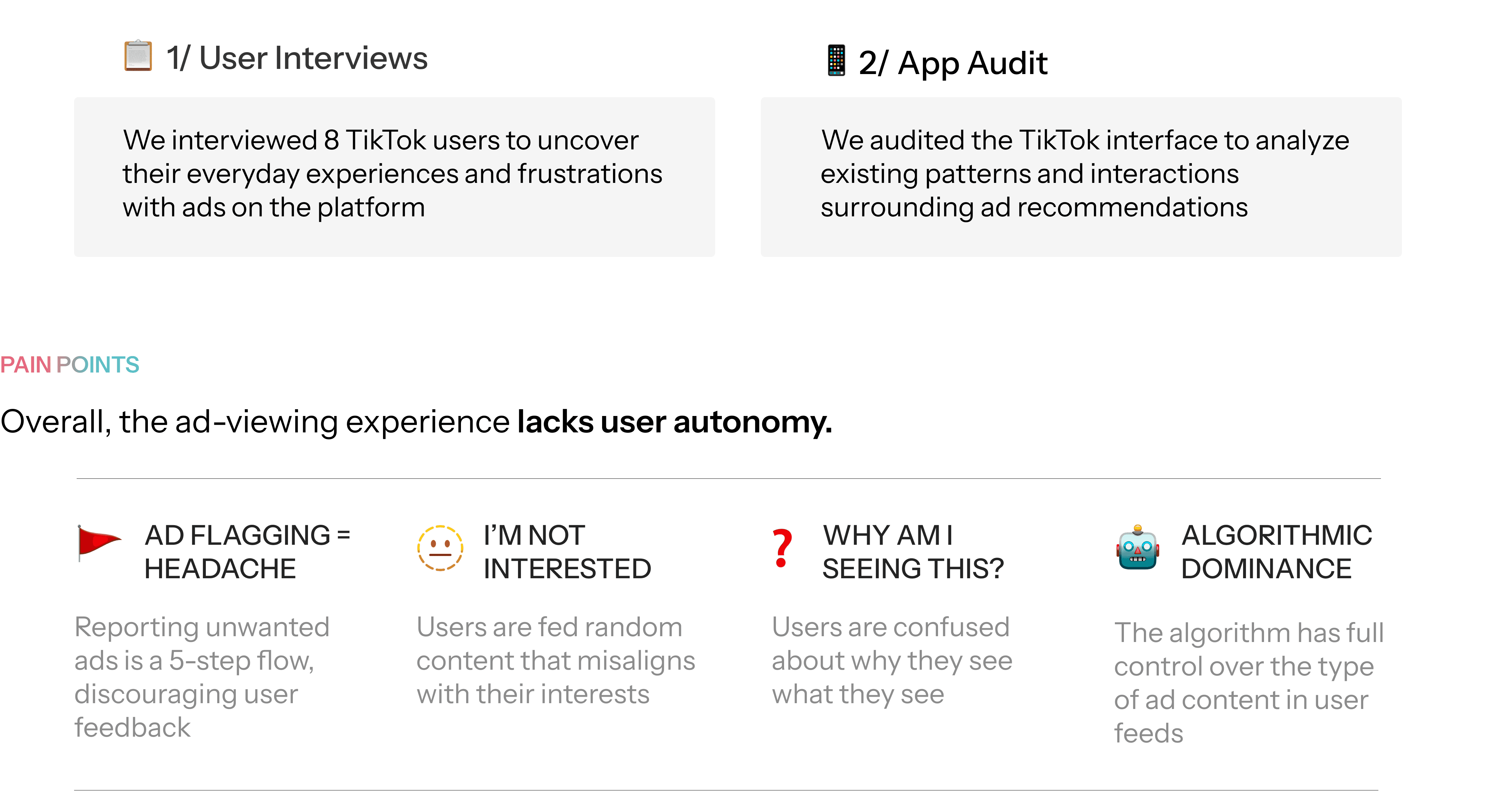
This becomes problematic for both users AND advertisers.
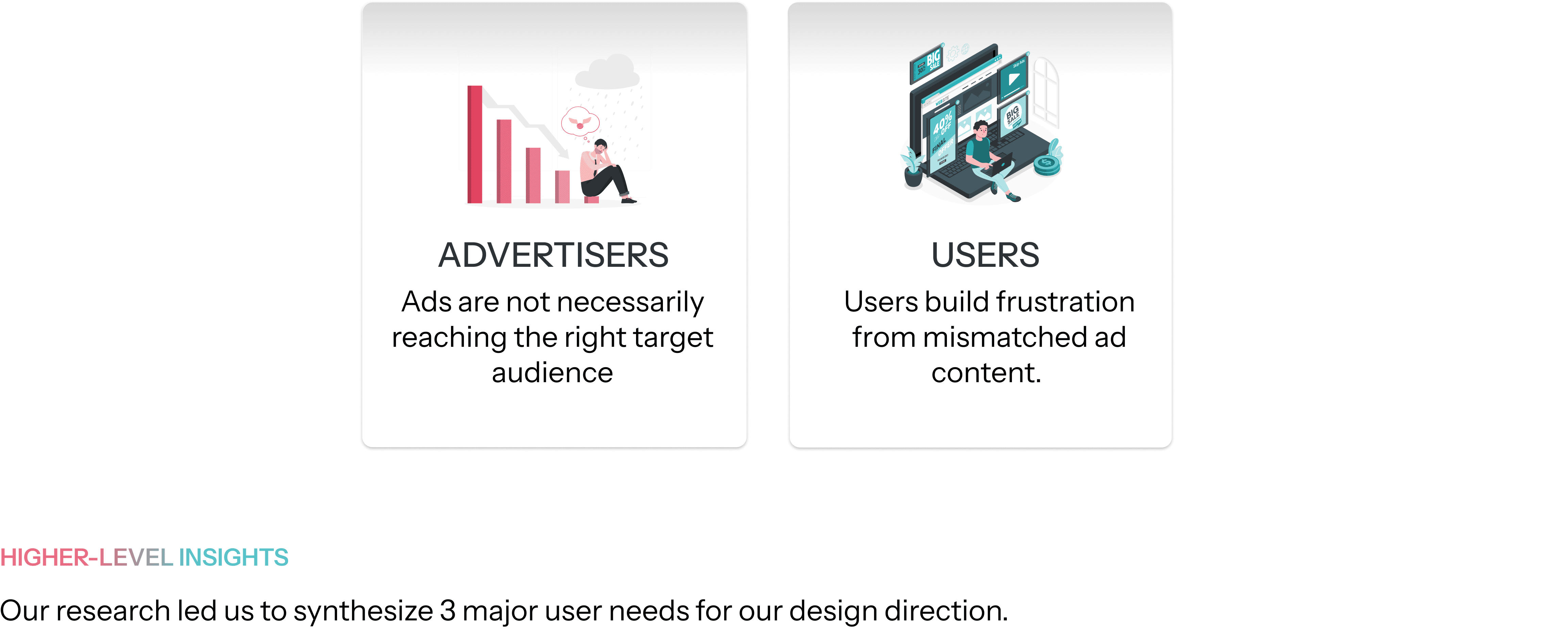

This led us to develop our guiding question:
What if users could choose their own ads and craft their own ad experience?
IDEATION
We spent 1 week playing with ideas for each of our high-level themes.
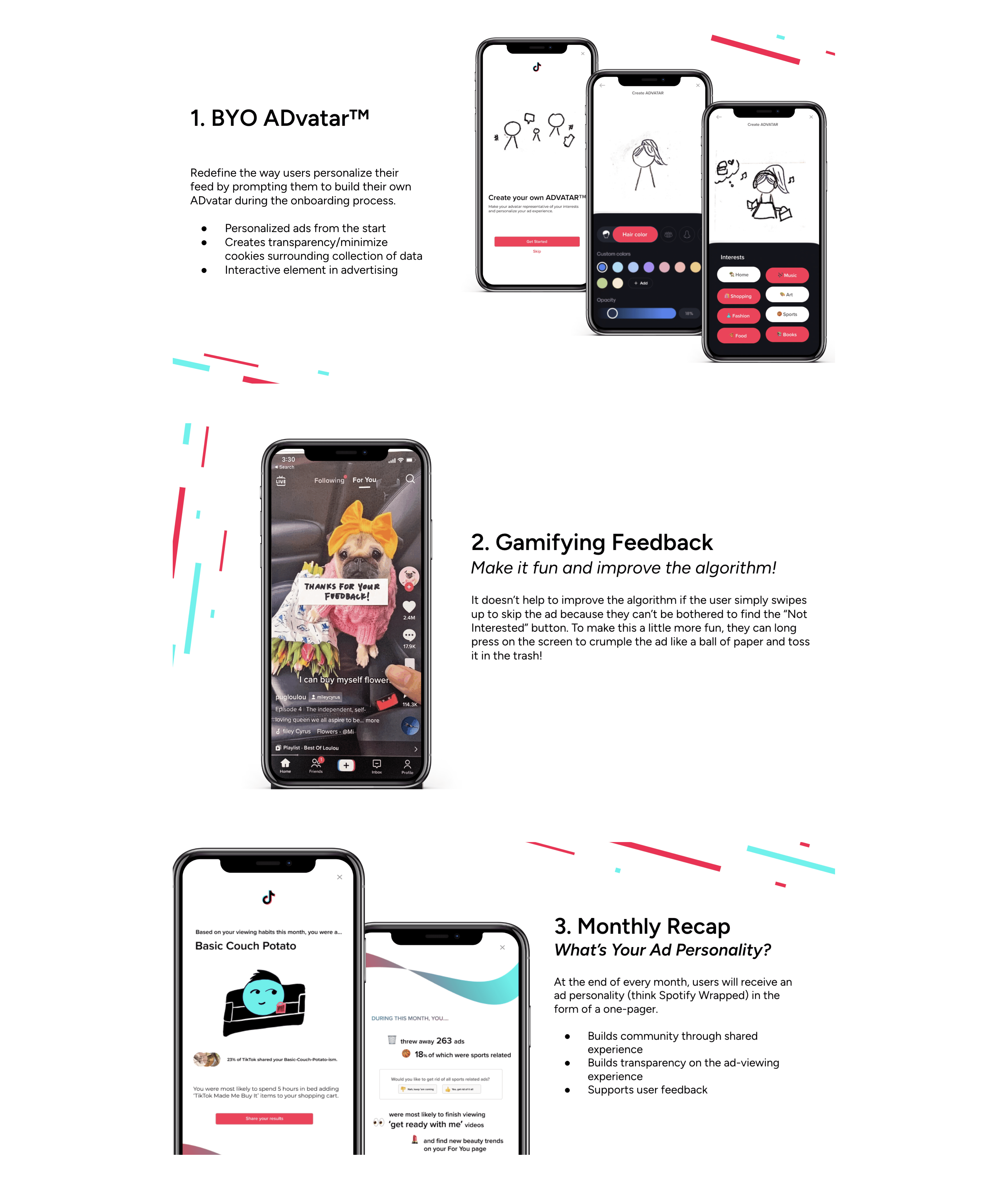
Our team did a quick design sprint and explored three initial low-fidelity prototypes of possible concepts we could pursue to personalize ads. Given the context that TikTok wanted broad ideas and concept suggestions, our ideas were intentionally out-of-the-box to help us think big picture.
CONCEPT TESTING
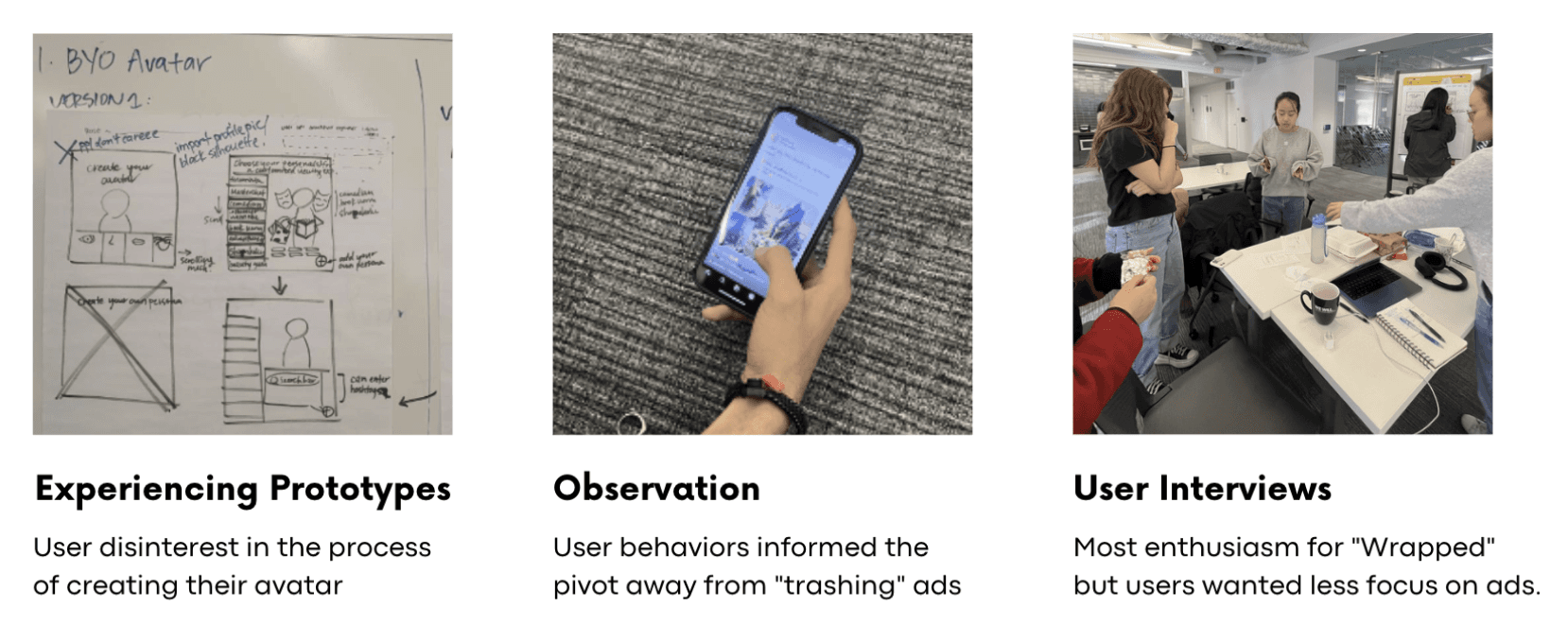
We conducted our first round of user testing to get a better sense of our design direction.

NOT SO FAST…
🚩 Our concept testing raised concerns about our overemphasis on 'advertisements'. No one wants an ad-centric TikTok experience!
The feedback we received identified the pitfalls of our initial concepts, mainly our assumptions about user behavior on the TikTok app. Ads on TikTok are a three-way relationship between the user, advertisers and the platform, but our ideation was geared towards the business outcome and neglected the user experience. We began reflecting back on our research insights to ensure we stayed grounded in human-centred thinking.
We asked the following questions to guide our pivot:

BACKTRACKING
BACKTRACKING
Back to the drawing board!
Our concept testing feedback pointed towards pivoting and reconsidering our research insights. Overall, we realized that users across the board valued:

Instead of making our ideas so ad-centric, we started thinking about ways to organically enhance the overall ad/viewing experience. We noticed that lack of user autonomy about what they watched was a recurrent theme. If users are *thought* to be in a certain demographic by the algorithm, this would naturally affect the sort of ads they are shown. However, as we learned through user research, users don't have an easy way to reflect upon their viewing preferences, and are at the mercy of the TikTok algorithm.
Backtracking to our concept testing, research insights, and guiding questions, we redefined our guiding question:
How might we create a playful way for users to improve their content recommendations?
IDEATION, 2.0
In Ideation 2.0, we built upon the success of our 'Monthly Recap' persona and in-feed content feedback, which were well-received by users and aligned closely with our aim of creating feedback channels. We then delved into brainstorming, seeking a more fluid approach to maintain our core values of feedback, transparency, and personalization.
The key concept that emerged was enhancing the personalized content experience for users and and subsequently redefine the ad delivery process. Taking cues from the success of Spotify Wrapped, we drew inspiration from the communal aspect found in platforms like Spotify. This led us to integrate a community element into our design, encouraging users to share and discover common viewing niches, fostering a more engaging and communal TikTok experience.

We also identified unique features and data points of interests for based on different demographic needs.
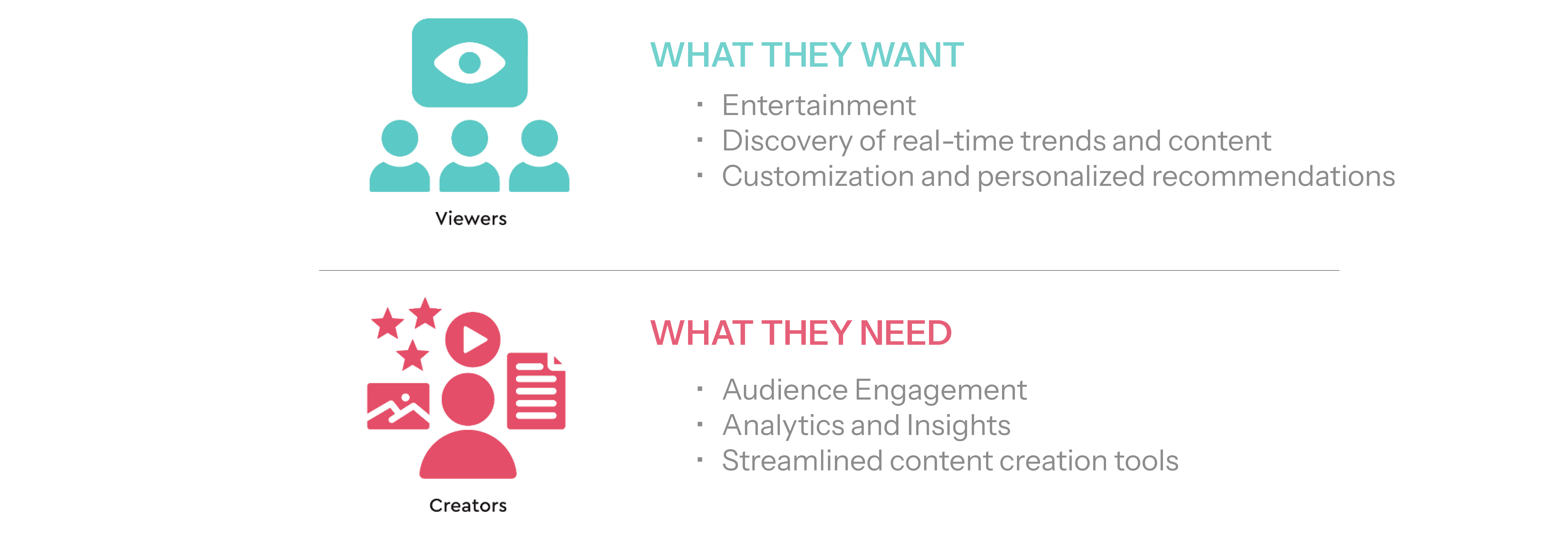
TikTok has two main user groups with different roles and needs - ordinary users and content creators. We conducted interviews with both demographics, gaining valuable insights to guide the design of the Monthly Roundup to cater effectively to each group's use case.
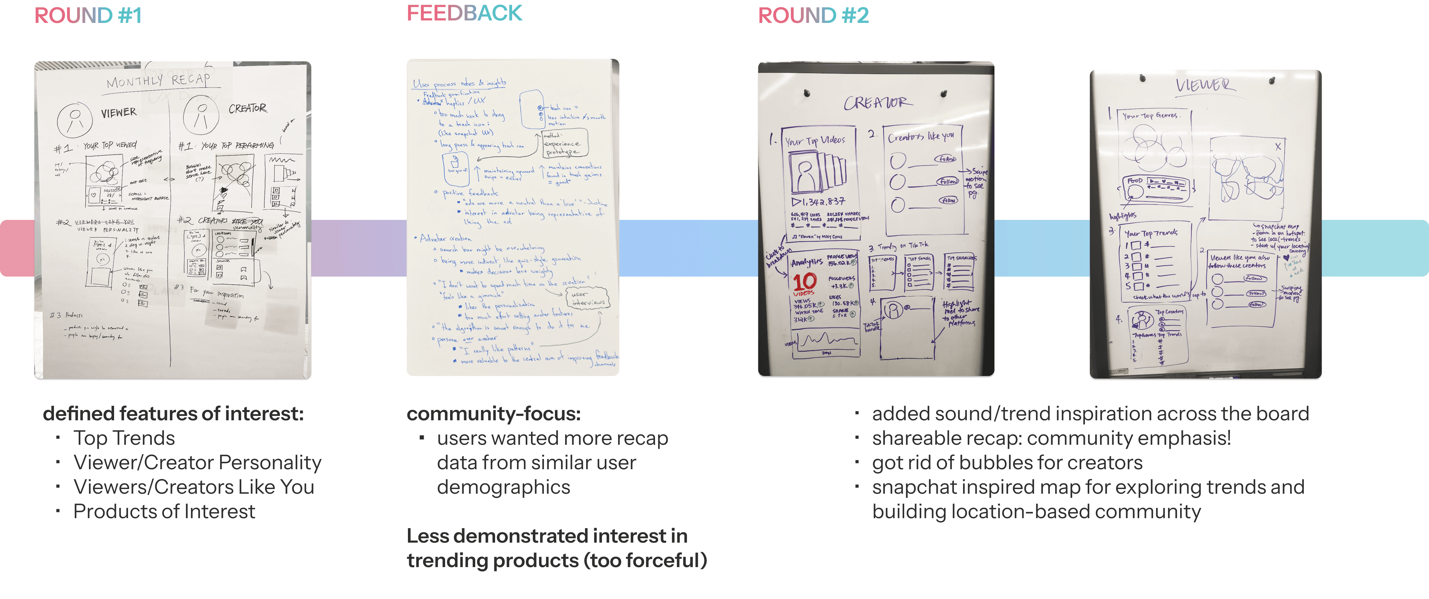
SKETCHING + WIREFRAMING
We explored features catering to our unique user groups and haptic interactions for an enhanced experience.
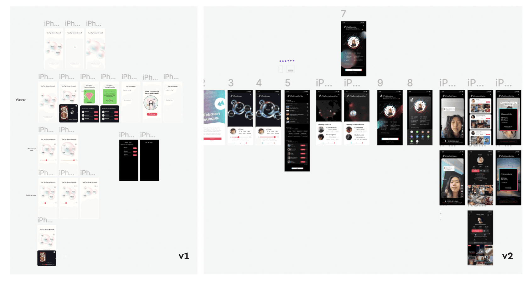
Once we settled on a design, we began translating our ideas into Figma.
STYLE GUIDE
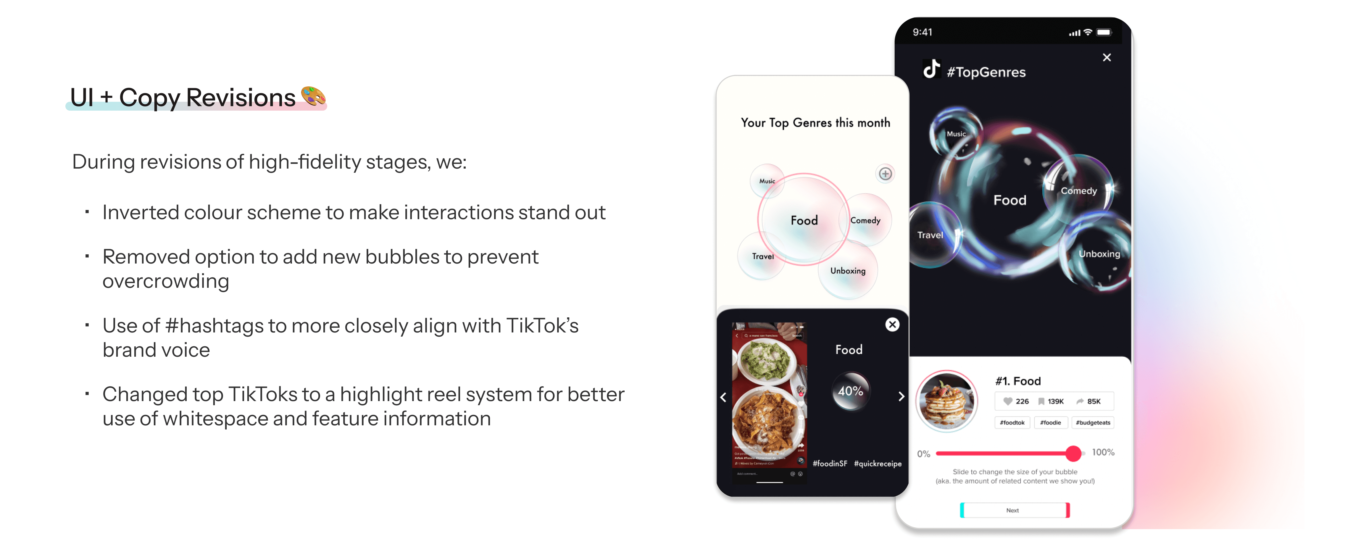
Since this involved a completely new design rather than just a new feature, our initial step involved a thorough examination of TikTok's typography and color palette, ensuring a cohesive and seamless integration within the platform.
FINAL DESIGN
Introducing - #MonthlyRoundup 🗓️
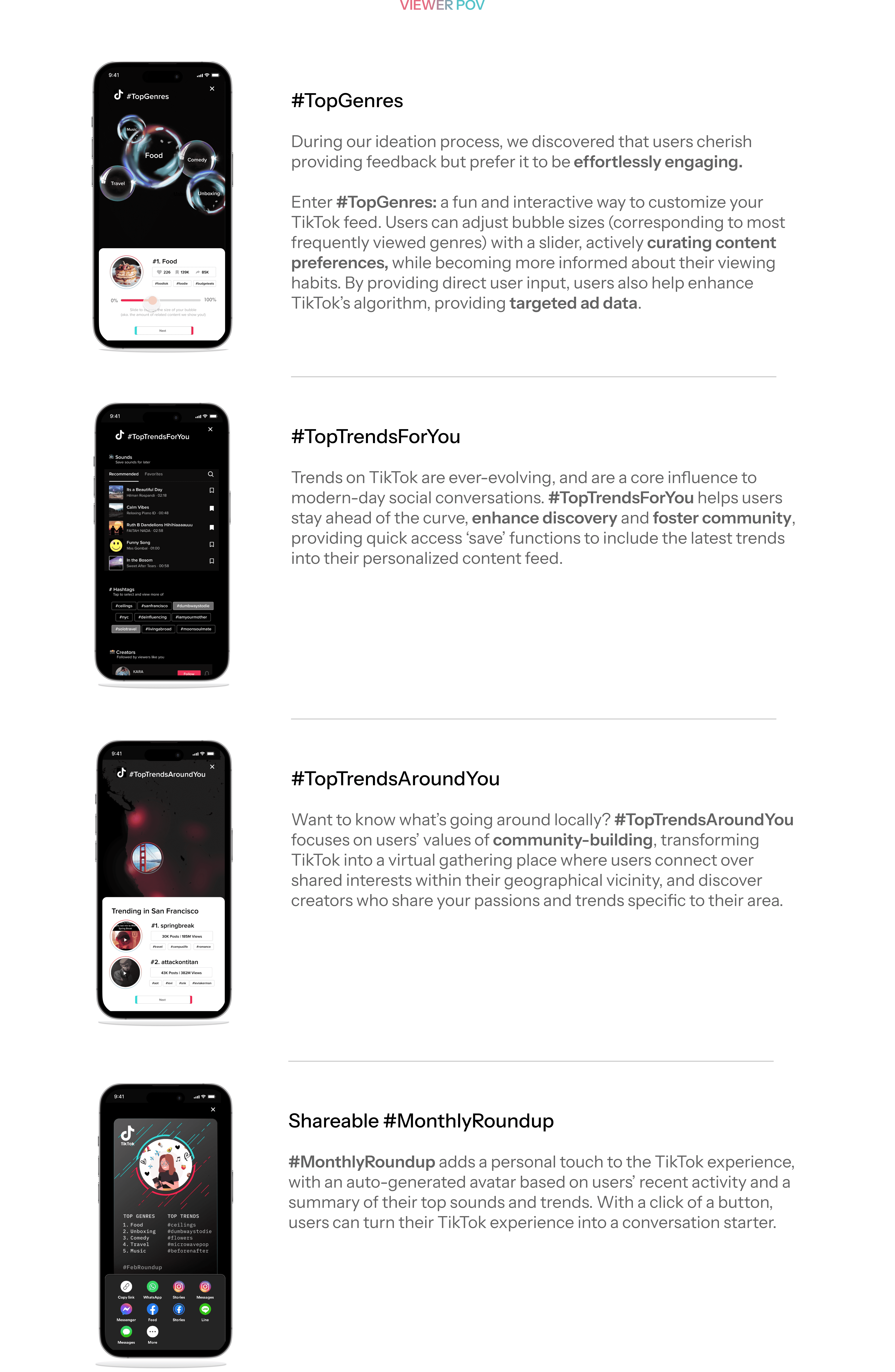
#MonthlyRoundup builds community and create shared experiences by helping users personalize their content feed and empowering creators to produce more impactful content. By providing insightful feedback, users also contribute to refining TikTok's advertising algorithms, resulting in tailored ad experiences.
REST & REFLECT ⌛️
🏃♀️ Embrace flexibility and evolve with insights
Even though our jumping off question was centered around ads, our user research and testing showed us how sticking to ads could impede, rather than enrich, the overall user experience.
This experience underscored the importance of aligning design with user behavior and preferences, and how important it is to approach design with an open mind. If we held our laser focus on a singular aspect, like ads, we might have overlooked more holistic opportunities for improvement. After all, successful design isn't just about solving a predefined problem; it's about uncovering and addressing the latent needs of users, even if it means redefining the problem itself!
📝 Why iterating in low-fidelity is important… as tempting as it is to skip ahead
For our initial pitch of 3 ideas, we did mid-fi prototypes (which we quickly realized took too much effort for something that we knew was going to be scrapped anyway.)
Throughout the rest of the project, we ended up doing live sketching iterations on a whiteboard and pushing the whiteboard around to our peers for feedback. Given our strict timeline, this allowed us to really refine and hone our design before proceeding to spend the most time on the design of our high fidelity prototypes.

